The visual editor
A drag-and-drop editor where what you see is exactly what visitors get.
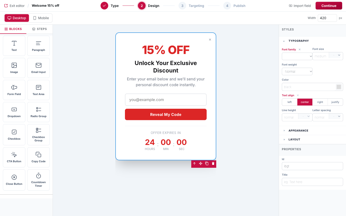
Layout of the editor
- Left panel: the Blocks tab (elements to drag onto the popup) and the Steps tab (the screens of the popup, see Multi-step popups).
- Canvas: click any element to select it. The toolbar on the selection lets you select the parent, move, duplicate or delete it. Double-click text to edit it inline.
- Right panel: Styles (typography, appearance, layout) and Properties for the selected element, such as the button text, the link or the field name.
- Top bar: switch between Desktop and Mobile preview and set the popup width in pixels.
Blocks
| Block | What it does |
|---|---|
| Text, Paragraph, Image | Headings, body copy and images. |
| Email Input | The email field. A popup needs one to collect leads. |
| Form Field, Text Area | Extra fields (name, phone, company, message…). Set the Field Name property: it is the key the value is stored and sent under. |
| Dropdown, Radio Group, Checkbox Group | Choice fields with editable options, great for preferences and surveys. |
| Checkbox | A single checkbox (for example a consent box), with its own field name and "value when checked". |
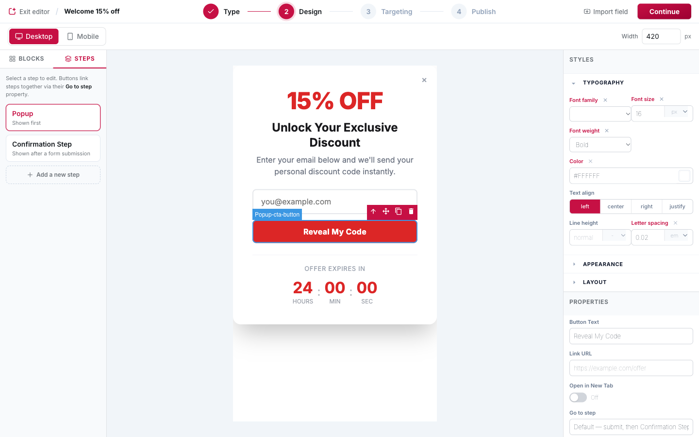
| CTA Button | Submits the form, opens a link or moves to another step (Go to step). |
| Copy Code | A discount code visitors copy with one click, with a "Copied!" confirmation. |
| Close Button | Closes the popup. Works as an icon (×) or as a text link such as "No thanks"; the text is editable. |
| Countdown Timer | A live countdown to create urgency. |
Buttons
Select a CTA button to see its properties:
- Button Text: the label (you can also edit it directly on the canvas).
- Link URL and Open in New Tab: turn the button into a link.
- Go to step: what happens on click. By default the form is submitted and the Confirmation Step is shown. See Go to step.
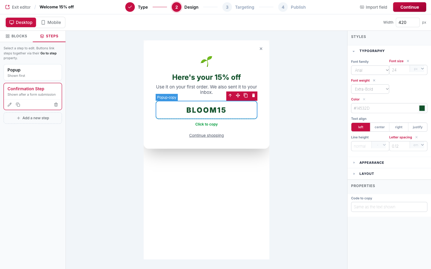
Copy-to-clipboard codes
Drop a Copy Code block and type the code directly on the canvas. When the visitor clicks it, the code is copied and the label below it changes to the confirmation text (for example "Copied!").
- By default, the text shown is what gets copied, so editing the code on the canvas is enough.
- To copy something different from what is shown, fill in Code to copy in the properties.
Form fields and hidden fields
Every input has a Field Name. Submitted values are stored with the lead under that name,
can be mapped to CRM properties, and can be used in action placeholders as
{{lead.field_name}}. Hidden inputs are collected too: they are an easy way to label a lead.
Import a field from a connector
Import field (top bar) creates a choice field pre-filled with the options of a field from a connected tool, such as a Mailchimp merge field or a HubSpot property. Values stay aligned with the destination, so no manual value mapping is needed.
Heads up
If the popup has form fields but no email field, the editor shows a warning: submissions need an email address, so leads could not be collected.
Saving
Click Continue to save the design and move on to targeting. The design of every step and variant is saved together.